
I participated in this project as an Ux/Ui designer for the creation and launching of a new website about the history of Mexico.
9 min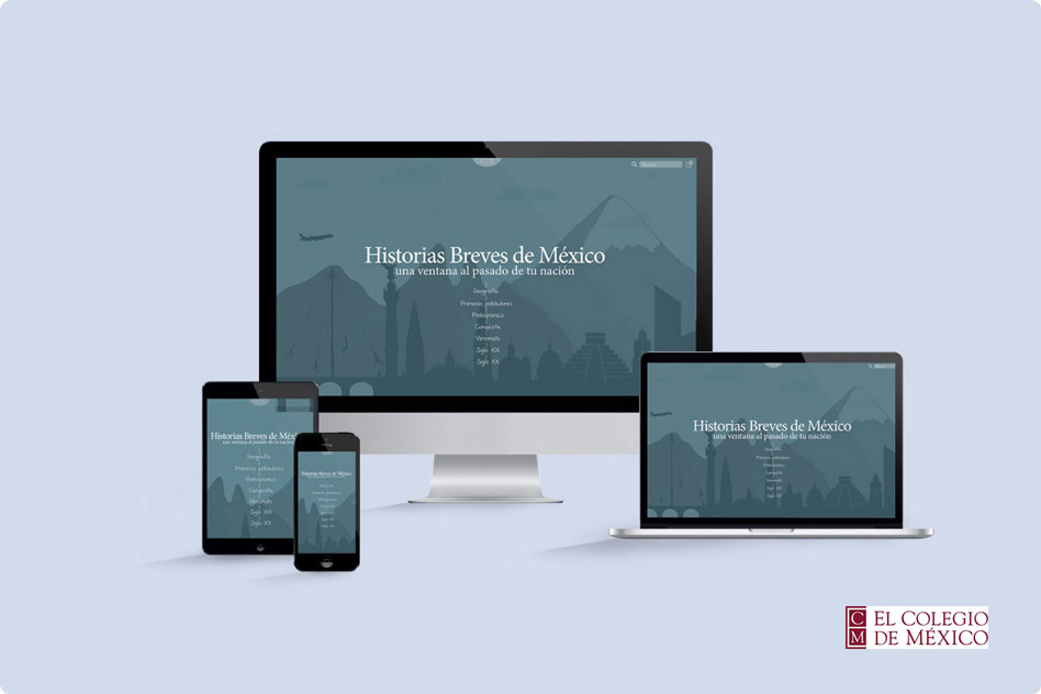
In 2015 there did not exist an official website with updated content about the history of Mexico. Most of the information on the internet about the history of Mexico was wrong or outdated.
Create a free website about the history of Mexico with content from its first settlers to the present. Supporting and initiating research, teaching and diffusion of the culture of “El Colegio de México”.
Students, professors, the general public.
With a content management system (CMS) that could be managed and updated often by the research team and historians of El Colegio de México
More than 10,000 educational pages with images and videos about the history of Mexico from its
first settlers to the present.
I participated in this project as the only designer of the team, I was responsible for directing
the visual style of the project while supporting the rest of the team in the development of the
product.
I collaborated with the product manager and the development team to ensure a balance between what
the company requested and what the user required.
These were the main requirements that El Colegio de México solicited for the development of the website:
As an initial proposal, the product was designed for students who were taking the subject of
History of Mexico in primary or secondary school and university, and also for teachers who were teaching this
subject in the study plan of the SEP (Ministry of Public Education).
The main users of the website would be:
Based on the goals of the project I designed 3 users so that the team had an idea for whom we are designing the platform, and could to try to discover the needs that each user has regarding the website.
With the support and research of the INEE (National Institute of Educational Evaluation) we found out that not all schools have an internet connection in their classrooms.
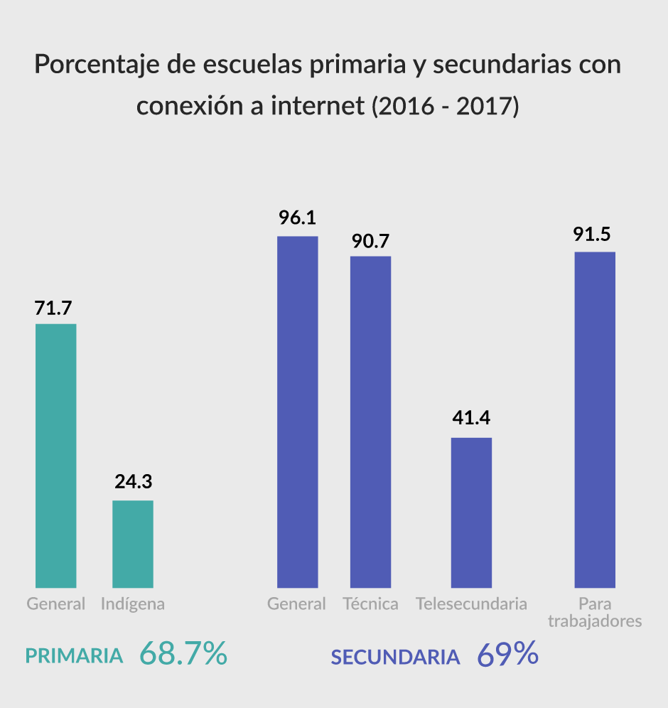
“In Mexico the 62.3% of elementary and high schools does not have access to an internet connection and does not have computers to guarantee an average of eight students per team for educational use.”
As a result of these investigations, we discarded the section on educational support for teachers, since most schools do not have the technological resources for teachers to take advantage of the platform in the classroom.
We realized that the information for the website content delivered by the authors and researchers was
not very related to the study plan of the SEP, and that the content was hard to understand for
students in elementary schools.
As a result of these investigations, we changed the target audience of the project, now
the website would be aimed at high school students and the general public who want to know
more about the History of Mexico.
We organized a meeting with the members of the project from different areas (authors, historians, content managers, designers and programmers) and invited some students so that everyone could share their points of view, ideas and requirements for the development of the website.
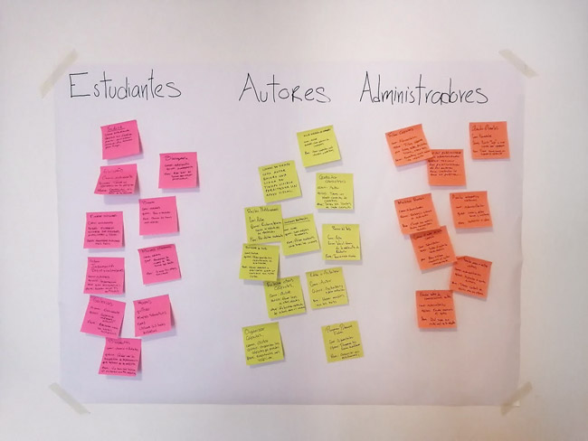
With this exercise we got many ideas and aligned our goals as a team. In this image I share some of the most relevant user stories of the students, authors, users and content managers.
Although we already had many ideas on how to organize the information of the website, we still had two big challenges that were requirements for the project. The challenges were:
These requirements established by El Colegio de México had the goal of creating a more attractive and interactive website, but although they were good ideas, after trying card sorting exercises and usability tests with 10 students, we noticed some drawbacks that I explain below.
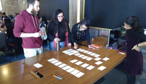
Card sorting exercise for map navigation and usability testing
I wrote on some cards some of the main topics of the history of Mexico and the name of the
states of Mexico where those events happened, then I asked the students to try to categorize the
cards in whatever order they considered correct.
Result:
The students were unable to categorize the cards successfully, the main cause
was because most of the students did not know in which states those events had happened.
Card sorting exercise for timeline navigation
I wrote important dates and events of Mexican history on the cards. I included some of the most popular
topics in the history of Mexico, and several titles of educational capsules that would be within
those topics. Then I asked the students to try to categorize the cards in the correct
order.
Result:
Just half of the users could categorize the cards correctly, the reason was that users did not
exactly remember the dates of historical events.
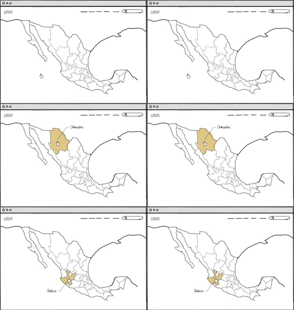
I made a prototype of this navigation proposal, and asked 7 people to try to find some of the
most popular topics about the history of Mexico.
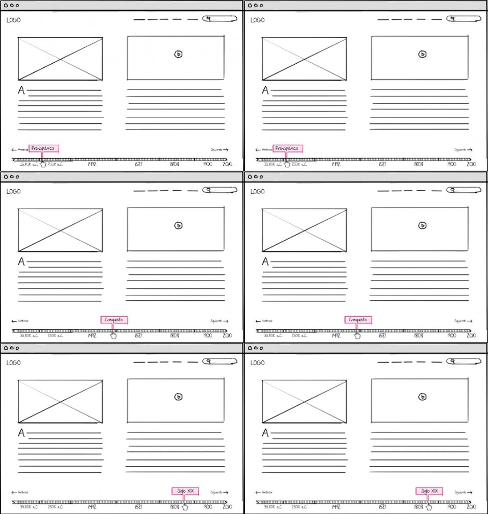
I prototyped the timeline navigation and asked the students to look for some capsules or themes
to see if they could find them easily and also to be able to observe how the user experienced
the navigation.
Keeping both navigations at the same time created confusion to users, although it seems that the
general history of Mexico and the history of each state are the same information, they are
actually two completely different contents and structures.
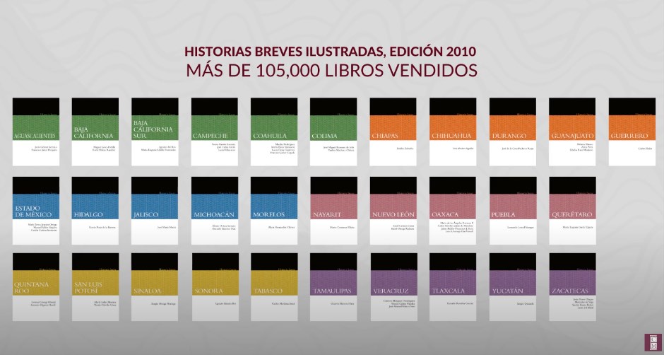
The objective of the map was to preserve the essence of the book collection Historias Breves, El
Colegio de México wanted all this information be freely accessible to the public, so they decided to
create another project that was exclusively for the digital version of the book collection
Historias Breves..
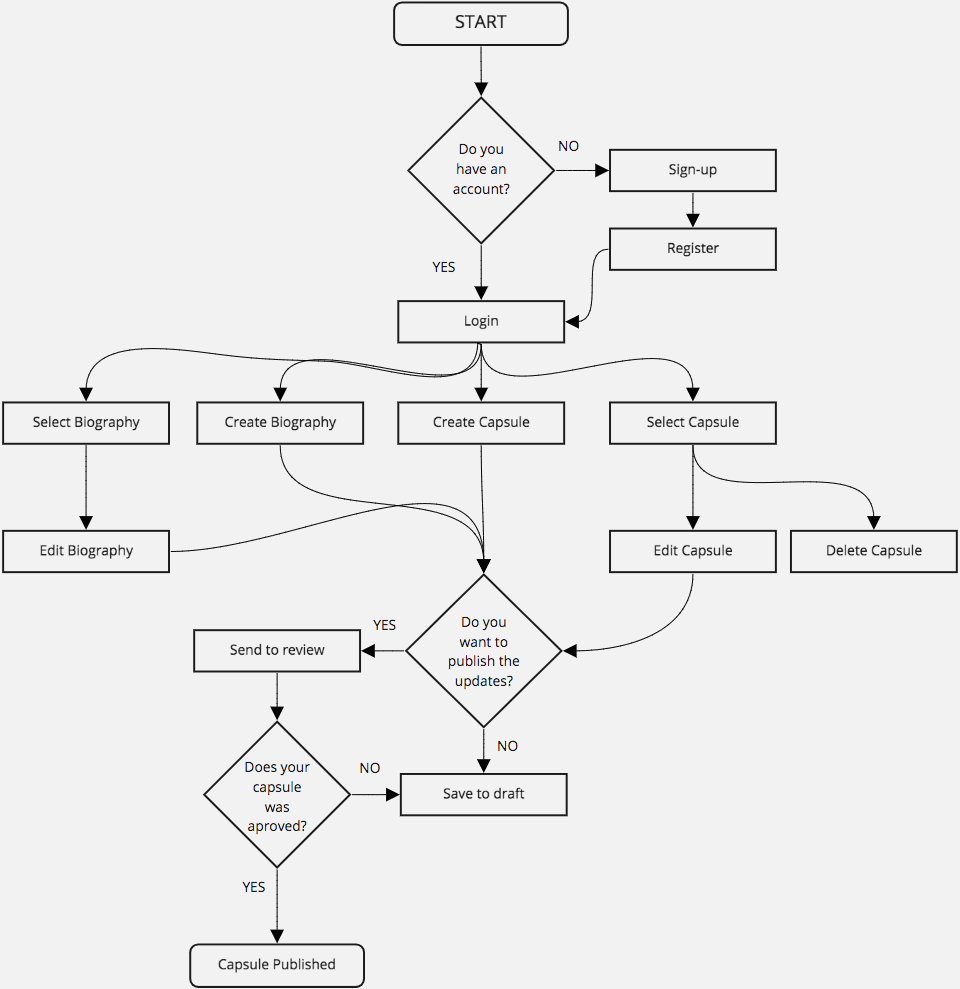
We discarded the map navigation and we focused on a chronological navigation.
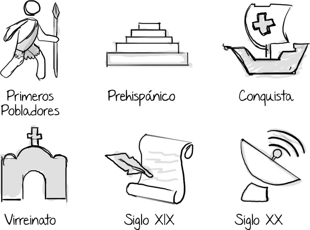
The simplest way to organize the site was to divide the history of Mexico into 6 periods. This way users can have a better idea about where to find the topics they are looking for without having knowledge of the exact dates or locations of the historical events.
After doing the tests with the students, we discovered that organizing the history of Mexico into periods made it easier for the users to find the topics that were of interest to them. Users could find a capsule theme in just three steps.

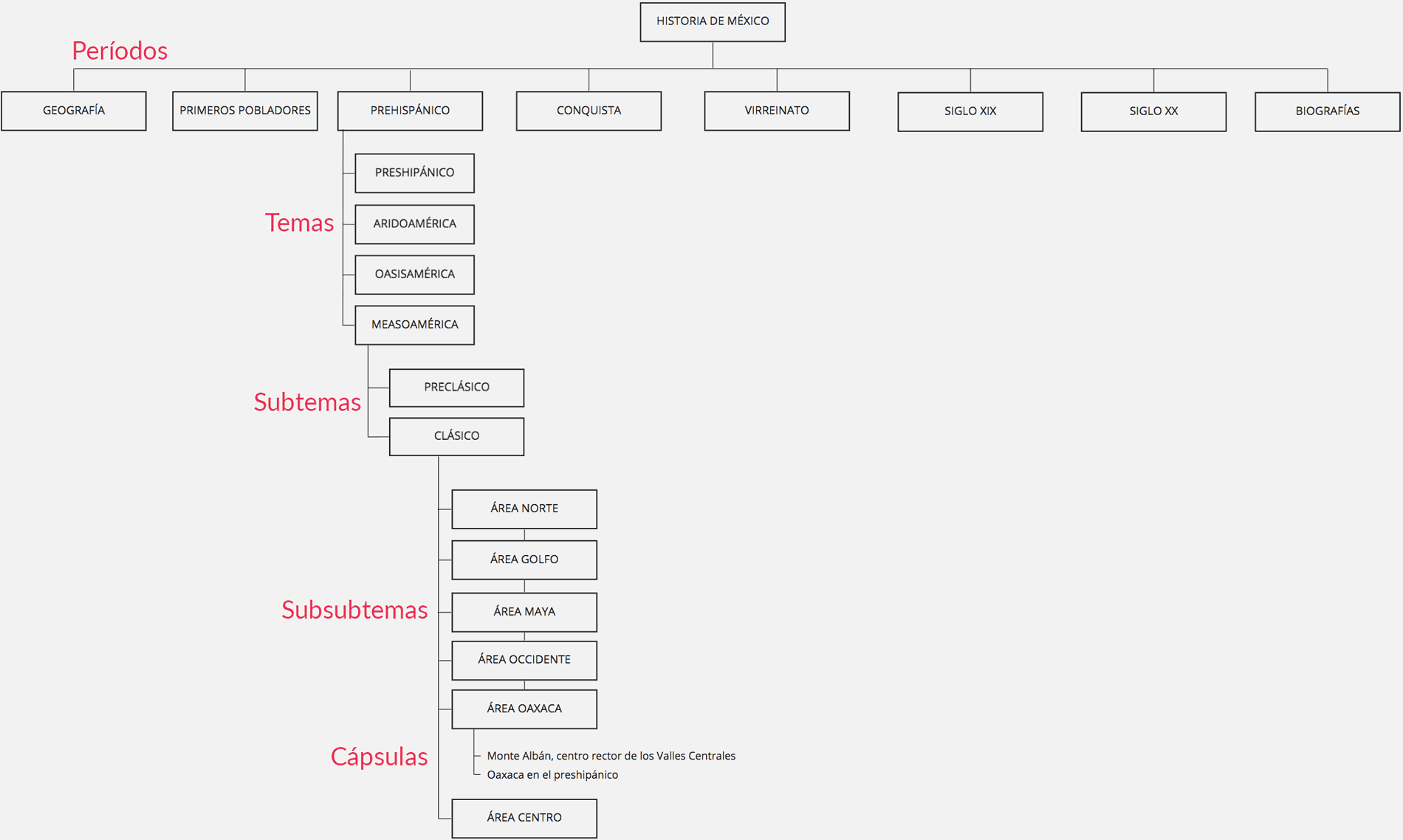
The website was organized chronologically into 6 historical periods, each of which can contain
different topics, and inside each topic it can contain subtopics and in some cases sub-subtopics.
A search bar would allow users to find any topic even if they do not know in which period the
historical event occurred.

I drew my first ideas for the site first on paper, and later I drew the wireframes on my Wacom tablet. It is
very useful for me to combine the speed of sketching by hand with the possibility of duplicating
and reusing the components in some design programs, the combination of both techniques allows me
to create more visually consistent wireframes that work great for early usability
testing.
These were some proposals that I designed for the navigation, of educational capsules and for the
website's appearance.
I chose the most efficient layouts to later prototype them and do usability tests to see which one was more efficient for users.
I designed the prototype with the software Invision and I asked 5 people to test the website. I asked them to find some topics or find information about a specific historical event.
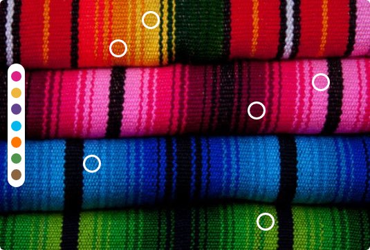
The website has 7 periods, (geography, first settlers, prehispanic, conquest, viceroyalty, century XIX and century xx), each period has a different color so users can identify them easily, also users can know in which period they are.
I designed a cover for each period illustrating some relevant historical event of each era, so that the users could get an idea about of the kind of information they could find in each period.
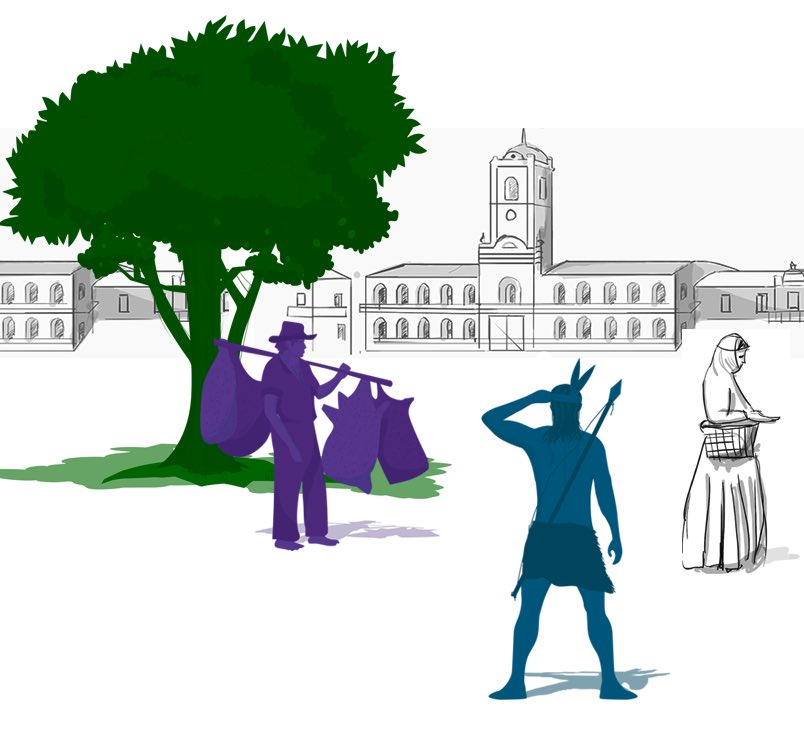
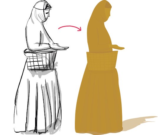
I searched image references of the most relevant and popular events of each era, I also tried to assign the color of each period according to the references of the context of each era
We found out these user behaviors after the first user testing:
I changed the place and color of the search bar, I made it more visible for the user, in the placeholder I changed the text “find” for some search ideas like “Topics, biographies, dates.”

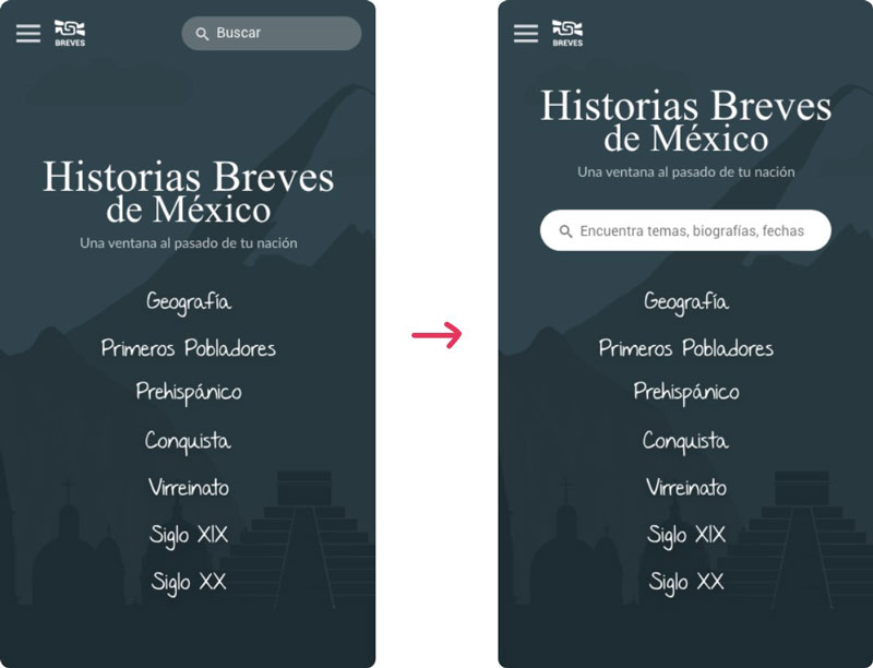
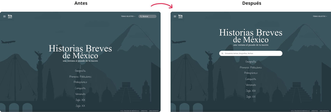
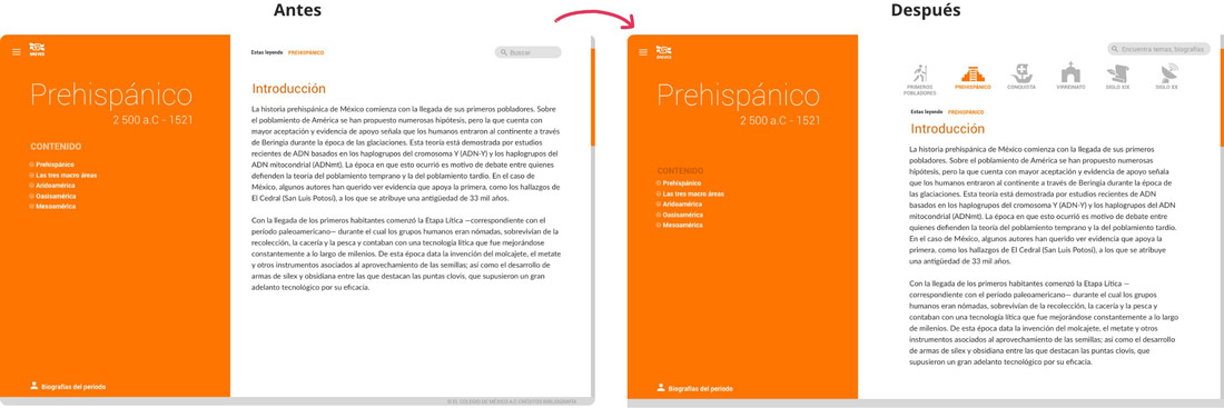
From this project I learned that having a good UX in your product will not only make products
more useful and valuable to people, UX also helps to reduce costs and delivery times for the company
who is developing the product.
The lessons I learned from this project: